Full Version: Images in Signatures of Posts (Sticky)
From: Trophyman [#8]
24 Jun 2006
To: Stunt Engraver (DGL) [#1] 25 Jun 2006
Thanks for the Info - looks like my logo is too big, and to be honest, I don't know how to make it smaller and then give it a link address, bit out of my league i think.
I do appreciate your post, looks like i'll have to dip out this time.
Cheers,
Phil
From: Stunt Engraver (DGL) [#9]
25 Jun 2006
To: Trophyman [#8] 25 Jun 2006
If you send your graphic to me, I can resize it.
From: Carl (CSEWELL) [#10]
25 Jun 2006
To: Stunt Engraver (DGL) [#9] 25 Jun 2006
You can get it off Trophyman's website: Trophyman website.
My reason for posting is to ask why the dimensions (60 x 400?) are what they are? Is it a bandwidth issue?
Trophyman's trophyman (which I'm assuming is what they would like to use) is tall and narrow. If you resize it to meet the 60 height limitation, it probably won't be recognizable. Should the limitation be set to 24,000 pixels (ie 60 x 400 or 400 x 60 or whatever combination you choose)?
Just curious.
From: Dave Jones (DAVERJ) [#11]
25 Jun 2006
To: Carl (CSEWELL) [#10] 25 Jun 2006
From: Harvey only (HARVEY-ONLY) [#12]
25 Jun 2006
To: Carl (CSEWELL) [#10] 25 Jun 2006
Dave jones hit it correctly. It is the size in vertical space that I find annoying even if it is not a billboard type signature. The size was set up for what felt comfortable to us at the time. There is always a possibility of a special case, but I do not think the specs will change much. That is my personal opinion, David may disagree.
The front page states 45 tall by up to 400 wide.
Mine is 44 x 240. There is one being used that if 52 tall, but is ignored because it would probably lose a lot by losing those few pixels, the fine lettering would become a blob.
EDITED: 25 Jun 2006 by HARVEY-ONLY
From: Stunt Engraver (DGL) [#13]
25 Jun 2006
To: Carl (CSEWELL) [#10] 25 Jun 2006
We just didn't want images in signatures to be too obtrusive, or distracting, in the posts. The same reason we don't allow animated signatures.
As Harvey said, we will entertain special exceptions but the exisitng pixel dimensions provide a good baseline for what we'd like to see.
From: Carl (CSEWELL) [#14]
25 Jun 2006
To: Harvey only (HARVEY-ONLY) [#12] 25 Jun 2006
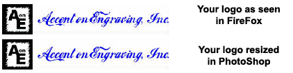
Interesting. If I 'view' your signature image, Firefox reports it being 55 x 300, as does PhotoPaint, with a resolution of 96 dpi. If I resample it to 72 dpi (normal screen resolution?), it is then 41 x 225. Does the forum software automagically convert the images to 72 dpi (or something else)? Or is it possibly a function of my screen resolution?
Gee, mine is 100 x 52 (tall), at 96 dpi anyway. It's less than that at 72 dpi. I guess I'll need to change my logo.
Thanks for the information.
From: UncleSteve [#15]
25 Jun 2006
To: Carl (CSEWELL) [#14] 25 Jun 2006
Odd! :S
From: Carl (CSEWELL) [#16]
25 Jun 2006
To: Stunt Engraver (DGL) [#13] 25 Jun 2006
Just the facts! That's all that's needed.
They do make it easy to identify posters. I don't have any problems with the dimensions/limitations.
From: Stunt Engraver (DGL) [#17]
25 Jun 2006
To: Carl (CSEWELL) [#16] 25 Jun 2006
Carl,
What happened to your signature image?
It wasn't obtrusive.
What's a little extra pixel height/width between friends? :-)
EDITED: 25 Jun 2006 by DGL
From: Carl (CSEWELL) [#18]
25 Jun 2006
To: UncleSteve [#15] 25 Jun 2006
Yep, the HTML code restricts the size of Harvey's logo to 240 x 44. Firefox reports the same dimensions under Properties, but when you view it in a new TAB (or Window), it shows the image at the full size without the HTML imposed limitation.
My logo doesn't (didn't) have the HTML coding to limit the size.
From: Carl (CSEWELL) [#19]
25 Jun 2006
To: Stunt Engraver (DGL) [#17] 25 Jun 2006
And where's yours? ;^)
From: Dave Jones (DAVERJ) [#20]
25 Jun 2006
To: Harvey only (HARVEY-ONLY) [#12] 25 Jun 2006
Plus it would be a bit crisper as a GIF.
From: Harvey only (HARVEY-ONLY) [#21]
25 Jun 2006
To: Carl (CSEWELL) [#19] 25 Jun 2006
If you guys keep this up, I'll have to post my new logo. I switched to it just before we had a winner in the EE logo contest. It is very similar. It is really too similar to the EE logo and would cause confusion.
[Yes I received permission to use it by it's creator because it is a derivative work.]
From: Carl (CSEWELL) [#22]
25 Jun 2006
To: Harvey only (HARVEY-ONLY) [#21] 26 Jun 2006
From: Carl (CSEWELL) [#23]
26 Jun 2006
To: Stunt Engraver (DGL) [#17] 26 Jun 2006
 Okay, since Harvey yelled at me (offline and nicely), I reluctantly restored the logo in my signature, this time according to the RULES. As you can see, I really didn't need the extra 7 pixels anyway. I even shortened the stack on my signature so it is even less obtrusive. We shouldn't be too free with those electrons! Pretty soon they'll be up to a nano-penny apiece.
The rules also state that you can include text so long as it is not a book. Are books okay for the images, just not for the text?
How about how I have my logo in this post (top-right corner)? It takes up virtually no EXTRA vertical space, although it does create more line(s) of text due to word wrap. Would this be acceptable for people with tall graphics that they want included in their posts as signatures?
From: Stunt Engraver (DGL) [#24]
26 Jun 2006
To: Carl (CSEWELL) [#23] 26 Jun 2006
Carl,
I like the size and orientation of your new signature.
I prefer all signatures at the bottom of the post window. If a little more height is necessary, in order for the more vertical images to be legible, I'm all for it, as long as it's not a "sore thumb" although an image of a sore thumb, or book will be allowed. :-)
EDITED: 26 Jun 2006 by DGL
Show messages: 1-7 8-24